Discussion: Interpretation
in: BigWillyStyle; BigWillyStyle > 2016-06-28
Jun 30, 2016 5:44 AM
#
That means that 90% lives in the white areas? I feel like the blue covers a lot of natural barriers such as mountain ranges. I am interested by how sustainably we are living in our chosen locations - dense or sprawling.
Jul 1, 2016 1:34 AM
#
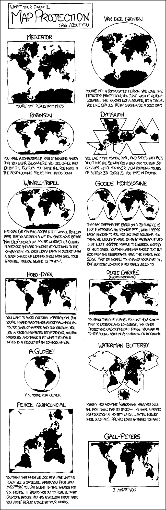
Uhoh, here come all the map projection nerds.
But perhaps a more elegant and less point-wise representation of this data would be a CDF of the world's population sorted by density (which should be called a Gini curve, but apparently isn't) and the resulting gini coefficient.
Special props to the alt-text pun.
But perhaps a more elegant and less point-wise representation of this data would be a CDF of the world's population sorted by density (which should be called a Gini curve, but apparently isn't) and the resulting gini coefficient.
Special props to the alt-text pun.
This discussion thread is closed.